Showing posts with label 4 Research. Show all posts

Tuesday, 16 May 2017

Logo Research:

Warner Bros.

1927
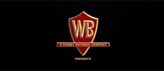
There is one huge element to the success of the Warner Bros. logo, and that is the amount of times it has been interpreted over the past 90 years, yet still stuck to the initial core aspects of it. It all started with 1927's The Jazz Singer, one of the original films to feature the logo, as seen on the left. It presented its studios in the shield with the WB squashed right down the bottom of the shield. This is the basic set up for what would be one of the biggest evolutions in the film logo industries, going from this black and white photo to a logo which looks more like the logo of a petrol station (under original), a Saul Bass edition which debuted in the mid 70's  (3  
1950's
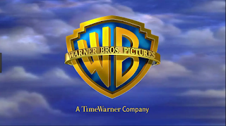
down from the bottom) and the logo which currently resides as the most prominently used design of today (four down from the top). It is unclear why Warner Bros. chose a shield to hold the letters, but I think it is a symbol of being set in stone, as if they are saying that their studio will always be around no matter what. The diegetic music in the background is also another evolving part of the logo, constantly changing with each
Saul Bass' 1970's
different design. This is another way in which the studio is willing to mix and experiment with its format, each piece of music reflecting its design in some way, for example, the latest edition of the logo has a very dreamy and almost angelic quality, reflecting the clouds and sky behind the shield.


Present Day 
I think the biggest reason for the success for the Warner Bros. logo is how they have kept the spirit and original basic layout of the logo, yet as time goes on they have stayed current and kept up with trends but are still recognisable. And this can be applied to any sort of logo design that we do, making a logo unique yet current and fresh. Throughout the last century they have been very willing to simply throw out a design after a few years, the Saul Bass design a good example of this, and completely experiment with another.

Paramount

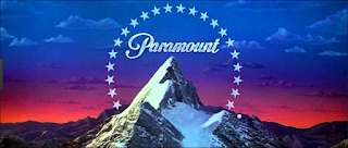
Paramount Studios is one of the most well-known and recognised film studios, and a lot of that is due to the logo and its fame. The first design, top left, was supposedly drawn on a napkin in 1914, and is a picture of the Ben Lomond Mountain. This mountain was quite close to the creator of Paramount studios, William Wadsworth Hodkinson, so he decided to use it as the face of his studio. the 24 stars is very symbolic, representing the 24 actors and actresses who originally signed onto the studio. It then was upgraded to focus more on the mountain-peak in 1952, painted by the chief painter of the company at the time. It did not use traditional film techniques to be displayed, but 
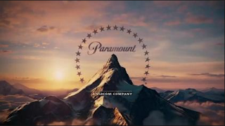
instead used a painting to be portrayed. The most current edition of the Paramount logo, created in 1987, has had very little changes made to make it what it is today. It is now CGI, and the stars seem to fly towards the mountain then settle where they are traditionally placed. This choice of CGI was put in place to make the resolution of the image much more clearer, and the pictures in the Paramount Pictures were removed to help
people focus in on Paramount alone. It is also interesting to note that music was only introduced to this logo in the most recent editions, the older ones absent of any sort of sound. The diegetic music reflects the grandeur of the mountain, with trumpets and brass instruments flaring, a grandeur that a lot of film companies want to achieve.  

This logo was successful mainly because it is a strong image, the mountain is a presentation of                                                                                         strength and confidence, with the fact of having a                                                                                    century behind them to help be recognisable help.                                                                                    This studio is a little different to Warner Bros. in                                                                                      terms of keeping their image very similar in each                                                                                    change. This can help boost recognisability and                                                                                        can help make your logo iconic.

Dreamworks:

The Dreamworks logo is the newest of the logos I have been looking at on this post, and is yet to have gone through any major changes. It was created by Steven Spielberg, Jeffrey Katzenberg, and David Geffen in 1994, and it is their initials which lie under the main logo. 'The Boy on the Moon' was created by Steven Spielberg, who wanted to recapture the Golden Age of cinema by using a man on the moon. It was the artist, Robert Hunt, who suggested it be a boy instead.                                                                                       Spielberg agreed, and hunt used his son as the 
model. In 1995 clouds were introduced to the logo, and this 'Cloud Cover' created a very idyllic and dreamy atmosphere, and the boy on the moon represented the inner child in everyone, speaking to their childhood memories. In the most current update, the colours are brighter yet still idyllic, and the words are now varied in colours. This represents the market of younger children they are aiming for, with a much more child-orientated feel to the logo. 
The Shrek Logo 
This company was successful from the start, firstly because of the men who started the company, who are all major Hollywood players. But also because from the beginning they have presented their company, through their logo, in the spirit they have wanted to capture. With such an imaginative and surreal picture, it truly does grab the hearts and childhood memories of those who do see it. There has always been room for improvement, yet they stick to their original concept and use it to find their audience.   

Sunday, 30 April 2017

Opening Sequences Thriller Codes and Conventions:

Memento:

In this psychological thriller, Christopher Nolan presented a film completely different to anything audiences had seen before, and used conventions to a new effect. It uses close-ups to to show what is happening throughout the scene, and to show us how the scene is playing out (which is, of course, backwards). An example of this is the development of the picture of the man who has been shot, fading away instead of developing. This forces us to focus in on what exactly is happening, and adds a claustrophobia to the whole atmosphere, an unsettling feel permeating off the shot. 
The use of a close-up to show how some events play out in
the scene helps adds a mystery to exactly what is happening. 
In this opening scene, we also experience a massive question which is asked in psychological thrillers, which is, is this set in the real world or set in the mind? From the first scene we are introduced to a way of editing which makes us immediately suspect what is happening. Obviously time does not go backwards, so are we seeing this character's memories? Is the character the narrator here? We ask these questions simply by the editing, and that is what a psychological thriller should do, and Nolan uses that to help build the audience's interest in the opening sequence.

Mirrors are a huge symbol and convention of the psychological thriller genre, used to reflect the person's inner self and explore their 'dark side'. Nolan takes this convention and twists it in a unique way, using a photograph to reflect the main character's inner self. We open on a shot of a photograph of a person who has been shot. Immediately we are opened up to the main character's actions and ways of dealing with a situation, and see a glimpse into his motives, telling us that this character is inherently violent and brutal, and we haven't even seen his face yet.

Here is a clip of the opening:


The Bourne Identity:

In Doug Liman's incredible thriller, he uses a lot of conventions in the thriller genre to help set up his film. One is the lighting of the opening, with lots of dark shadows and unclear images, the water obscuring vision, this method is used to create mystery and makes the audience question what is happening. It could also be seen as a way into Bourne's mind, reflecting the murkiness of his memory and past.
The shadows surround Bourne, reflecting how he is
shrouded in mystery. 
Another convention the director uses is the use of shots to portray Bourne, usually using a range from medium wides to extreme wides to show Bourne's situation. These are used in action thriller to express clearly the action taking place or in other thrillers to express loneliness of a character. In this scene Liman uses it more for the loneliness factor, helping to show the audience Bourne's drifting and loneliness. It, again, makes the audience question the situation, wanting answers from the small teaser of an opening.

Here is a clip of the opening:
     

Drive:

This neo-noir crime thriller by director Nicolas Winding Refn has a very subtle yet important quality, opening with a rule that the audience needs to know for the rest of the film. It uses a quality that is very important to neo-noir thrillers, which is the lighting. The tonal values that ooze from this shot are soft yet dark, with a lot of difference between light and dark. This can be symbolic of the danger of the driver's job, how he is in a sea of danger yet he stands and prospers in this setting. This entices the viewer into the intentions of the driver, and makes the viewer want to know more about him and his little business he runs.

This picture expresses the tonal values of this scene.
Another thriller convention Refn uses in this scene is the use of diegetic sound in the scene, a very slow, subtle beat vibrating throughout the scene. This trope is used in thrillers to help build tension and sometimes to add an unease to a scene, and this is definitely present in this clip. The sound is almost frantic in nature, and this can reflect the nature of the "five minute window" he gives to his clients, and this can help give the audience a glimpse into the frantic nature of his job for his clients, that time is ticking.

Here is the clip:

Wednesday, 12 April 2017

Representation Codes and Conventions

1) Gender

Into The Badlands (2015)

In this fight between Barons Quinn and the Widow, the producers have quite cleverly subvert the views of gender that a lot of shows have. Usually the female is presented as a love interest in need of safety and protection, but here they are presented as someone who stands up to the male and takes them on with equal skill. The use of keeping the camera focused on both characters and not just the male helps show how well matched they are in battle, the use of the camera facing down on both of them at 0:49 showing weaknesses in both characters. Both wearing dark colours gives a subtle power to both, again not raising the male above the female in appearance, but showing both to stand out from the pristinely white-washed background. The editing allows focus on both characters to recover from injuries and enjoy success, which helps add this overall balance of power and skill to the clip, the audio full of diegetic sound amplifying both character's successes and failures. Overall, there is a massive balance in each character in this scene which is a huge subversion of the gender trope of men having more power than women.

A shot which expresses the balance of character domination in the scene with both characters being given an overhead shot.

2) Ethnicity

To Kill A Mockingbird (1962)

In this scene from the 1962 classic, there is a huge underlying theme of racism running through it. The lack of MCUs and any type of close-ups of Mayella helps give us a separation from him, with the use of MCUs of the woman helping us to feel aligned to her views. The editing of the scene quickly passes Mayella and instead lingers on the woman and how she reacts to the scene, which forces the viewer to observe the scene from her perspective as we witness her reactions more than Mayella. The lack of dialogue from Mayella and the overwhelming cries of the woman also pound us with her voice and views, dumbing down Mayella's opinions and perspective. The clothes that Mayella wears gives him a much more poor, lower-class status, but the dress of the woman seems much more elegant and more higher-class, which gives her a power of status over Mayella, which at the time was common for these races to be organised in such a way status-wise. 

The use of focusing on the back of Mayella helps show how much power this ethnicity has over the woman.


3) Identity

The Bourne Identity (2002)

In this clip from this 2002 thriller, it is a key moment in exploring the topic of Bourne's identity. We are shown different elements of Bourne's past with the bullet wounds and the holographic display item. All of this is shown with uses of dark lighting, only some small glowing lights showing the audience what is happening, displaying how shrouded Bourne's identity is and how there are only a few things which point him in the way of finding this identity. A lot of the shots throughout of Bourne are MCUs and close ups, helping to express the confusion he feels about his identity, the shakiness of the shots also showing us how unstable Bourne is as a character in this moment. The editing throughout is slow and observant, taking its time to give us a minimalistic picture of who Bourne is and what state he is in. And the audio of the piece is very raw, not hiding any sounds such as the thunder rumbling, which shows the rawness and simplicity of how we see Bourne, and how we only have a very small idea of who he actually is, a very raw picture.

Close Up of Bourne trying to take in the situation around him, a huge feeling of disorienfad etation is around this character


4) Romance

La La Land (2016)

The song 'City of Stars' in this hit film really does catch perfectly the dream-like romance between Sebastian and Mia. The tracking camera, almost as if it is simply observing what is happening, gives an ethereal flow to the actions of Sebastian as he dances and sings his way around the wharf. The audio is fully non-diegetic, again lifting the audience out of reality, helping the audience observe a flow throughout the sequence, their relationship seemingly in a more dreamy state than real. There is only one transition to another shot in this clip, a fade at 0:48 which again carries this ethereal feel, a soft transition to Mia not a harsh cut, their romance soft and building, seemingly like no troubles. The lighting is made up of purples and greens, and these colours do not clash with one another, they fade into each other softly and seamlessly. There is a certain encompassing of green in the second half of the clip, which could represent their love wrapping around them more and more, yet it is still soft.

The green lighting can represent how they are basked in love and romance

5) Age

The Breakfast Club (1985)

In this excerpt from the classic film, there is a definite contrast of ages portrayed. There is a definite separation portrayed through the use of different sized shots, with the teacher shot mostly with medium shots, but a lot of MCUs for the students, which helps represent the power the teacher has over them, encompassing more space of the room. The audio for the scene is completely diegetic, planting us in the now, the awkward silences helping to align us with what the students are feeling, which is already a sickness of being there, representing the childish age they are in. the editing is slow, observing each character's reaction to what happening around them, which represents the different ways each age group reacts with the same situations. The mis-en-scene is quite bland, and is very simplistic, which can represent how the students are feeling at the time, which is most likely boredom. 

The focusing on different reactions really helps show how each age group reacts to the situation


6) Class

Blade Runner (1982)

In this iconic moment from the philosophical sci-fi, there is a huge representation of the balancing of classes. Deckard, in the universe the film is set in, would be considered as part of a higher class than Batty, yet here the camera is presenting them in either a close-up, MCU or Batty as the more dominant, representing the balancing of these two classes. The audio is a mix of diegetic and non-diegetic, which could possibly represent the mingling of the two classes, and once again the balancing of power. The editing is slow yet not lingering, which can help show the progression to the ultimate balancing of classes through a steady climb towards that point, which is when the speech 'Tears in the Rain' starts. The lighting is blue and hazy, which can represent, however, the haziness of where the power of which class lies, asking the question of who really has more control over this situation?
The use of haze and blue is used to great effect in this clip


Tuesday, 7 March 2017

Thriller Sub-Genres

Action Thriller:

This sub-genre uses physical action to create the suspense in a film, involving various types of stunts, fights, and chases to help build the tension and suspense in a film. A trending convention that runs through them is using a resourceful hero who has to struggle against seemingly impossible odds. In the plot the antagonist is usually a terrorist or psychopath, and the protagonist is usually crime-fighting in some way. This involves themes of hero verses villain, and the maiden being in distress, the protagonist having to retrieve her from the villain. In terms of mise-en-scene, guns and other types of weapons are used by the protagonist and the antagonist, and the lighting is usually a bit brighter and high-key than other thriller sub-genres to show the action taking place clearly, but this isn't always the case, with low-key lighting used to create an atmosphere of uncertainty and heightened danger, portrayed in these scenes from 2012's Skyfall. Higher-key lighting here, and lower-key lighting here.

Some examples of action thrillers are
Die Hard (1988)
Skyfall (2012)

Kill Bill: Vol 1 (2003)

Crime Thriller:

A crime thriller is a mesh of the suspenseful elements of a thriller with the plot of a crime film. The plot typically centres around the criminal and his actions, and the protagonist and how he tries to solve these crimes. They can use both action and psychological elements to help build suspense and tension, this tension usually built up slowly throughout as the protagonist solves the crimes. There is always an enigma surrounding the antagonist and his actions, helping add to the mystery that the protagonist must solve. Guns are very symbolic of danger and murder, the use of a weapon used in a crime and by the protagonist. In these films the lighting is very low-key, shadows  and dark colours used to add a murkiness to the cases, an unease. The camera work is usually used in close ups at the crime scenes, indicating to the audience what they should be looking at to piece together the puzzles in their mind. 
An example of this sub-genre are:

The Usual Suspects (1995)

Film-Noir:

This sub-genre is not named this just because of its storyline and conventions, but for its stylistic way of depicting the story in terms of mise-en-scene, which was popular during the 1940s and 50s. This lighting is presented in a black and white palette, with stark lighting effects.This can help produce a sense of nostalgia, a throwback to the past, reflecting the flashbacks it uses. The main character involved is usually cynical in some way, and this sub-genre relies on a narrative voice and flashbacks to explain its intricate plot. 

An example of this sub-genre is:
Sunset Boulevard (1950)

Psychological Thriller:

Utilising the traits of a regular thriller, this sub-genre builds on it by incorporating elements of drama and mystery. the suspense is usually wrapped up in the main character's mind instead of a more physical threat. The protagonist tends to rely on mental resources rather than physical to solve the problem at hand. It can also blend with the horror genre. A huge theme that this sub-genre deals with is the question of reality, is this set in the real world or is this tension all in the character's mind? This creates an unease and an uncertainty to the whole situation. Linked to this is the theme of identity and how that affects the plot, with mirrors used to reflect the question of the person's inner self and explore their 'dark side'. This exploration of the inner self is further helped by the use of mid-shots and close-ups, helping to portray the character's emotions and give a much more  up close and personal view of them.

A few examples of this type of sub-genre are:

Memento (2000)

Taxi Driver (1976)

Rear window (1954)

Science Fiction Thriller:

This sub-genre incorporates hypothetical, science-based themes such as unexplored locations, fantastical quests, and advanced technology. A lot of these films deal with the future and and what happens in the near or distant future, including scenarios of aliens invading earth, dystopian societies, and super diseases. The music within this sub-genre can vary, sometimes using more space-age sounding music involving keyboards and electric guitars etc. But, as in Guardians of the Galaxy (2014) where the soundtrack is from Star-Lord's personal playlist, the music can be associated with the main character. The mis-en-scene in this type of film can vary hugely, with the settings and props having to work within the time-period and tone that the director is aiming for. For example, the movie Aliens (1986) has very old and decrepit props to show their age and use, and the settings are dark and dingy, adding a sense of lurking from the aliens and heightening their threat of danger. On the other hand, the film Oblivion (2013), where the props are much more technological and clean, and the settings are much more modern and again technologically advanced, giving a less grounded look to the future and a more advanced feel. 

A few examples of this type of sub-genre are:

Aliens (1986)

Oblivion (2013)

Guardians of the Galaxy (2014)

Religious Thriller:


This sub-genre injects religious themes, such as life and death, heaven and hell, the soul etc, into its overall message. Some revolve around a specific church, but a lot of them usually include supernatural experiences not pertaining to a certain religion as a major part of their plot. This sub-genre can tend to mesh with horror films and psychological thrillers, The Exorcist (1973) a classic example with its purely horror elements of gore and supernatural aspects involving demons, but using this in a religious setting of an exorcism. The editing of a religious thriller can usually be fast cuts to capture the tension in the moment, but is sometimes slow and building with its tension and suspense. This slow pace editing at the end is used in The Da Vinci Code (2006), where the reveal is told in slow, mounting shots of Tom Hanks' character running around solving the final puzzles.

A few examples of this sub-genre are:

The Exorcist (1973)

The Da Vinci Code (2006)

The Devil's Advocate (1997)

Wednesday, 22 February 2017

Opening Sequences

1. Purpose of Opening Sequences

The basic purpose is to present to the audience the key creative roles in the making of a film with some elements of the story or of characters integrated with the credits. The duration is usually around 2-3 minutes long, but can sometimes go for longer. It usually displays the settings of the film, sometimes during the credits, an example being Alfred Hitchcock's North By Northwest. Or there may possibly be a whole scene before the title sequence begins that establishes a setting. A great example of this is the James Bond film Skyfall, which has an action set-piece before the title credits begin. 

2. Difference Between Opening Credits and Title Sequence

The difference is that as the Title Sequence is only the main creative roles in the film, separated from the rest of the film and the story it's telling. However, the term 'opening credits' not only covers the text in the sequence, but also covers the technical aspects of the title sequence, such as audio, video, animation, editing techniques etc. 

3. Techniques in Opening Sequence  

There are various techniques used in an opening sequence. One is the use of an establishing shot of a setting. This helps the tell the audience where the film is set and what environment the characters will be interacting in. A great example of this is the opening credits of Jaws, in which the establishing shot is under the water, showing the audience where a lot of the drama of the film is going to take place. 


Another technique used is a montage of some sort, developing a much more abstract visual presentation than what the film will actually look like. this does not always tell us what the settings are, but can give a hint to the audience what the tone of the film will be, and what the character's personality's are. An example of this is in Edward Scissorhands, where it is simply a montage of different items and statues, but all these hint towards the overall tone of the film and its style.


Modern Thriller: Skyfall

This film uses various techniques to achieve the opening credit's purpose. The film not only presents to us key creative roles in the film, but throughout the opening credits gives us insight into Bond's psyche. 

The shots are usually wides or extreme wides of Bond drifting, especially at the 0:54 and 1:00 marks. This gives the effect of separation and isolation, that now Bond is all alone and will be for a few months. This helps set up where the character is at this stage in the story, after being shot.

The point-of-view shot at the 0:58 mark of the clip of the hole that sucks in Bond gives the audience a sense that maybe it is hopeless for bond, that he will be sucked into the tow of death, no escape from the path he is on. The dolly shots used in the sequence give a feeling of constant movement, reflecting the movement of the water and its flow, this foreshadowing that what the villain, Silva, is planning on doing is completely out of bond's control, sweeping Bond away through his plan.   


The use of non-digetic sounds throughout the opening credits, with only Adele's Skyfall Theme playing, add to the effect of isolation I mentioned before, no sounds from the real world able to be heard, suggesting that Bond is slowly having less of a grasp on the real world. The transition from digetic to non-digetic sound at 0:34 also add to the feeling of a transition from life to death, a swift and seamless exchange. 

Very little editing between shots during the opening credits, mainly use of mise-en-scene to transition from setting to setting. There are a few uses of jump-cuts, for example at 1:15, which adds an abruptness to the scene.

However, there is a lot of symbols in the mise-en-scene. There is the imagery of Bond's childhood home, with Bond's eyes looking out from underneath the the wallpaper of the mansion at 1:46. This is showing the audience that this house is a direct path into why Bond thinks and acts like he does, that his secrets lie in this house. Also, the blood-red artificial light on the trees do give the effect of blood surrounding this house, possibly symbolising that this place is tied directly to his blood, it is part of what made his blood as cold as the blue that fills most of the opening credits. Also, the imagery at 2:49 of chinese dragons foreshadow the importance of the location of Shanghai in the film.

Hitchcock Thriller: Vertigo

Hitchcock used a variety of techniques in his opening sequence for Vertigo. The shots are extreme close-ups of different parts of a woman's face. This gives a sense of claustrophobia and being held tightly in place. The extreme close-up of the woman's mouth with the name of the actor who plays John Ferguson, the character who has vertigo, could suggest that she is a strong link to what happens throughout the rest of the film, that it is her lies that lead to something important happening in the film.

The use of non-digetic sound throughout the whole opening sequence gives the audience the feeling of a rising tension, the use of suddenly rising then slowly falling music adds an uneasiness to the sequence, reflecting the climax of the film which involves climbing up a tower then falling off.
There is a fade in from the eye to the black background with spirals at 1:30 of the clip. This fade adds an uncertainty to the sequence, reflecting the tone of uncertainty and dizziness the main character has.

The use of a woman as most of the background of the sequence shows the audience again that this character is the sole reason for a lot that happens throughout the film, setting up the plot for the audience. 
The different colours of the spirals give a feeling of disorientation, maybe even hypnosis, giving the effect that John is disorientated and has no control over his condition. It could also suggest that there are several shades to the lead woman of the film, different layers of deception. The use of artificial red light on the woman's eye also gives the feeling that there is almost an urgency to the film, but that there is an artificial side to her, adding to this tone of deception.

Contrasting Techniques

With mise-en-scene, the Skyfall opening credits focus much more on the plot of the film than Vertigo, with a series of foreshadowings with symbols and colours, such as the example I gave with the Chinese dragons. Still, it focuses heavily on Bond's psyche using different symbols of his past, such as the example I gave with the mansion before. Vertigo is much more character based in using mise-en-scene, with the artificial red shining on the woman and the different components that are shown of the face giving away more about characters than the story ahead, the most obvious foreshadowing to the story being uses of the different spinning spirals, referencing the story being about a character having a problem with vertigo.

With editing, the both opening sequences don't have a lot of cutting involved (bar the opening action scene before the credits in Skyfall. They both have fades and cross-fades, Skyfall integrating jump-cuts throughout. There are a couple of uses of cross cutting throughout the Bond sequence, but not many.

In terms of audio, the vertigo opening sequence has all non-digetic sound, a slow pace then sudden sting in the theme creating an unsteadiness to the tone. The Skyfall scene has a transition from digetic sound to non-digetic sound, then uses a theme song to carry the rest of the sequence. This is typical of Bond films.

The camera shots used in each sequence are completely different. While Skyfall uses mostly wides and extreme wides of Bond, creating a sense of isolation, Vertigo is all extreme close-ups of the woman's face, giving a very claustrophobic feeling. These different shots create completely opposite tones.