Monday, 25 September 2017
Tuesday, 22 August 2017
Foundation Portfolio - Creative Critical Reflection
Sunday, 30 July 2017
Foundation Portfolio - Storyboards
I was assigned, as cameraman, to draw up the storyboards for our Foundation Portfolio. From the moment we came up with the idea for a techno thriller, I had specific shots which we have kept through till the end, the very first the medium-wide of the robot standing up and finishing his monologue (under the storyboards). We didn't make many changes after, just a few to help the flow and make the shoot a little easier because I made some plans to do shots that were just too complicated. An example of a shot we changed was from a medium-wide of Jim grabbing an axe and smashing the computer to a close-up of him shooting the computer. The change from an axe to a gun was a big part of this change but also the sense of claustrophobia is kept with the close-up.
The main challenge for this storyboard was
achieving the transition from shot 3 to shot 5.We
were forced to re-shoot shot 3 as the shots did not
match up well.
Shot 2 of the second storyboard remained a
close-up, but the restrictions of our location meant
we had to rotate the shot and film from behind
Jordan Parratt.
The first shot on this board was filmed over Jordan
Anderson's right shoulder to capture Joseph in the
shot. This board involved the most movement to
shoot so there was difficulty in such a crammed
space.
The most changes made out of all the storyboards
as when we found our location there was no space
to have Joseph thrown into the ground. Throughout
the shoot a lot of changes made due to the limited
space we had.
Saturday, 22 July 2017
Foundation Portfolio - Shot List
For our foundation portfolio I was assigned to do the Shot List which I had previously done in for our Preliminary Task 1. I did not write down any of the additional shots planned because those were really just in case we had time, which we did not end up having. The shot list was a huge help in keeping the rest of the team on track for where we were going, able to scan it and see how many shots were left to get. For me, however, I worked much more with the storyboard, a visual way of me keeping track of the amount of shots needed and what they needed to look like, an aspect important for the director.
Wednesday, 7 June 2017
Foundation Portfolio - Treatment
Prepared by Triple J Studio and Jackson Doudney
19/05/17
It is proposed that the film will be of 1-1:50 minutes duration, and that it will be filmed at the following locations:
 Garage/Mechanics Workshop
There is a used and worn down look to the area, as if it has been used and lived in for years which works very well with what we imagine with this dirty and grounded future. The claustrophobia created by this space as well is a huge help as when the robot attacks the cluttered space seems to trap them with this unstoppable force.School Classrooms/Library
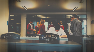 This represents a place of learning and knowledge, and we are trying to express the creativity and brain activity that young Jim is using. It also is a great way of presenting Jim as a very anti-social child, completely isolated in his thoughts and dreams. The open space and cleanliness shows the purity of his imagination, there is no dark foreshadowing or cluttering of his mind, there is only the vast creative hope he has.
This film will include the following conventions of thriller films:
Darker Lighting
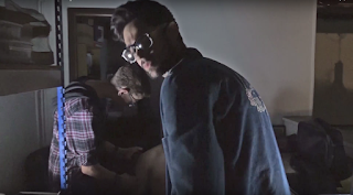 This helps give a solemn tone which can convey foreboding, giving the tension more unease and a more gripping atmosphere. This can make audiences more interested in what is happening on screen by making them question everything on screen on a basic curiosity level. This is also a convention used in many thrillers to represent the dark nature of the content of what is happening on screen, giving us a pathway into the darkness of what is being created, a contrast to the hope of what the android could be.
Slow-Build Tension
Builds much more anxiety because you draw out the tension more and more, the audience forced to watch that little bit more of whether it will all work out for Jim or not. This is also a clear way of contrasting how the characters would feel at this point of time as well, they would feel like this chaos is happening in split seconds yet it is actually plummeting slowly, the decent into chaos taking its time. This is will be used through the technique of a slower editing pace.
A very common symbol in the thriller genre, this is a symbol of danger but is being used to help the main character, ultimately being used as a weapon of momentary destruction for the robot. It is a contrast to the high-technology, symbolising how the old values and ways of life are not simply a disposable, out-of-date system, they hold value.
A Slower-Editing Pace
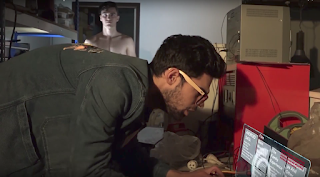 Unlike action thrillers, the editing of this film is planned to be a little bit slower than what is conventional in an action thriller, which is usually more fast-paced and contains quicker cuts to feel a more rush of action. In our film, there are a few quick cuts to help jump-start the tension and get the action moving, but it is mostly based on what goes on inside the frame and the use of composition to heighten tension. For example, in this shot to the right we use Jim in the foreground and the robot in the background, slowly walking forward and hard to
see to indicate the build towards Jim's death.
After watching the following thriller films/thriller openings I have been influenced by:
The Bourne Identity
 After studying this film, I saw the way that director Doug Liman used dark lighting to really help sell the uncertainty and mystery of the origins of Bourne, managing to turn the ocean into an almost claustrophobic space. We have incorporated this palette of dark lighting to help emphasise the claustrophobic atmosphere of the garage. There are moments to breath in The Bourne Identity such as when he visits Marie at the end where she is hiring out motorbikes for a living. We have this space at the beginning of our short, a dreaminess helping to elevate Jim's naivety, the reality hitting two thirds into the short.
 Vertigo
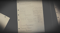 The way this opening incorporates the seamless transitions from the face to the inside of the eye did help to inspire the opening credits of our short, where the camera transitions from the Triple J Productions logo to the piece of paper then up to young Jim. This use of presenting the main character without actually showing him is also an idea which is used in Vertigo, the use of spirals presenting the main character's biggest weakness immediately, and we do this through showing young Jim's plans on pieces of paper.
Problems Encountered:
-The stunts involved with Joseph being thrown against the wall. We will solve this by using the metal shelves as a way of stopping the audience the audience from seeing the full impact.-Stunts involving Jordan Parratt being thrown around and beaten up. We will solve this by having the actual impact of Jordan hitting the ground being slightly distorted and out of focus and out of shot slightly.
-Small area to film in, so we will have to make use of the all the space carefully.
-Operating the steadicam will need to be precise with such little space. We will solve this by alternating between the steadicam and the shoulder mount to get certain shots.
The film will include the following:
1) Characters:
-Jim: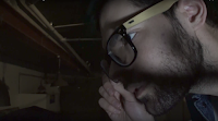 The main character and driving force of the film; he desires to create a groundbreaking invention that will forever change the world, but is over hasty; he symbolises a warning to the dreamers and entrepreneurs of our time: create, but always be cautious, because you could be creating the next world-changing invention for good or bad.
-Kodie:
 Jim's assistant who is the robot's first yet certainly not last victim; wants to help Jim create this game-changer of an invention; he is just another victim of Jim's drive and creative mind; he symbolises the people that can be affected by the drive and determination of the inventors of today.
-Android:
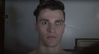 The masterpiece of Jim's determination; is simply doing what his virus-filled programming is making him do; it symbolises today's technologies and its dangers; the virus symbolises that little bit of motive or wiring that can completely change technology's function.
2) Ideology:
-Our overall message of the short is basically a warning for any sort of inventive project: be careful, you can either create your dream or a nightmare.-The robot represents all the creative advancements which have happened in recent years and soon to come.
3) Mood and Tone:
The overall tone of the short is quite dark, with hope being slashed and wiped away mid-way through. This can be associated with a lot of action thrillers where the opening scene sets up the danger for the rest of the film.4) Camera Shots, Movement/Lighting/Angles:
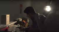 -Near-to-none wide shots, mostly medium-wide to close-up
-Very few completely still shots, mostly movement throughout the shots
-Lighting of the shots is quite dark, with darks being crushed and people illuminated by very specific light sources
5) Themes and Motifs:
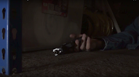 -The gun is a symbol of protection, but it is fighting against violence
which is its nature, it could be taken as a symbol of the quote,
"Death begets death begets death etc".
 -A theme, although subtle, is selfishness, which is shown through the character of Jim. He presents this theme in the way he strives for his technological advancements without thinking about the others who could be in harm's way.
-How technology can harm os instead of help, it can be something as small as a virus that can ultimately wipe out those who interact with technology.
6) Narrative:
An inventor full of dreams and creativity finally creates his biggest dream: a fully functional android. But a virus floods its servers, and it turns on both him and his assistant, killing them and the inventor's dream of a better future.7) Sound and Music:
-I want most of the audio in this short to be diegetic, with the "soundtrack" a throbbing bass in the background-There is a slight chance of there being non-diegetic audio, such as some music to help ramp up the tension or audio-ended up using Chromatics' Tick Of The Clock as our main source of tension- building audio
8) Use of Credits and Logos:
 The opening logo is what is going to transition us into young Jim's world, and the credits are going to help show us his inventive abilities as we see his plans for the future. The final end logo with the Techno Terror expresses the journey to the terror of technology ruining our species.
9) Editing:
It is going to vary in parts, whereas the building to the robot's attack is slow-paced, the actual attack is fast-paced. There is a continual build towards the resolution, with the use of a fade in-and-out of black representing the character's POV, expressing his struggle to focus on the future which he envisioned, he has finally woken up to the awful reality that this world will never exist.Summary:
 Beginning
Young Jim is dreaming about his future, and we see Jim and Kodie uploading files for the robot.
 Middle:
The robot beats Jim into a bloody pulp, but Jim manages to destroy the computer which keeps the robot going.
 End:
End:
The robot lies on the floor, Jim and the assistant dead, but it gets back up, finishes the monologue it started at the beginning of the short and walks away.
Conflict/Tension in the Sequence:
-The robot attacks the assistant after a virus infiltrates its system, and is advancing towards Jim-It is ironic how when the robot goes haywire and kills the assistant that Jim has been so obsessed about this project, yet he doesn't realise what is happening when it is advancing to attack him
Further Notes:
-This robot is a constant threat to human life, and the rest of the film would follow a human being trying to do everything in his power to stop this android from wiping out society.Tuesday, 16 May 2017
Logo Research:
Warner Bros.
 |
| 1927 |
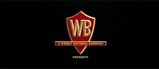 |
| 1950's |
 |
| Saul Bass' 1970's |
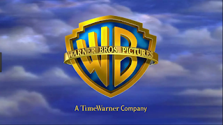 |
| Present Day |
Paramount
Paramount Studios is one of the most well-known and recognised film studios, and a lot of that is due to the logo and its fame. The first design, top left, was supposedly drawn on a napkin in 1914, and is a picture of the Ben Lomond Mountain. This mountain was quite close to the creator of Paramount studios, William Wadsworth Hodkinson, so he decided to use it as the face of his studio. the 24 stars is very symbolic, representing the 24 actors and actresses who originally signed onto the studio. It then was upgraded to focus more on the mountain-peak in 1952, painted by the chief painter of the company at the time. It did not use traditional film techniques to be displayed, but
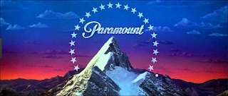 instead used a painting to be portrayed. The most current edition of the Paramount logo, created in 1987, has had very little changes made to make it what it is today. It is now CGI, and the stars seem to fly towards the mountain then settle where they are traditionally placed. This choice of CGI was put in place to make the resolution of the image much more clearer, and the pictures in the Paramount Pictures were removed to help
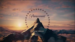 people focus in on Paramount alone. It is also interesting to note that music was only introduced to this logo in the most recent editions, the older ones absent of any sort of sound. The diegetic music reflects the grandeur of the mountain, with trumpets and brass instruments flaring, a grandeur that a lot of film companies want to achieve.
This logo was successful mainly because it is a strong image, the mountain is a presentation of strength and confidence, with the fact of having a century behind them to help be recognisable help. This studio is a little different to Warner Bros. in terms of keeping their image very similar in each change. This can help boost recognisability and can help make your logo iconic.
Dreamworks:
 The Dreamworks logo is the newest of the logos I have been looking at on this post, and is yet to have gone through any major changes. It was created by Steven Spielberg, Jeffrey Katzenberg, and David Geffen in 1994, and it is their initials which lie under the main logo. 'The Boy on the Moon' was created by Steven Spielberg, who wanted to recapture the Golden Age of cinema by using a man on the moon. It was the artist, Robert Hunt, who suggested it be a boy instead. Spielberg agreed, and hunt used his son as the
  model. In 1995 clouds were introduced to the logo, and this 'Cloud Cover' created a very idyllic and dreamy atmosphere, and the boy on the moon represented the inner child in everyone, speaking to their childhood memories. In the most current update, the colours are brighter yet still idyllic, and the words are now varied in colours. This represents the market of younger children they are aiming for, with a much more child-orientated feel to the logo.
  |
| The Shrek Logo |
Monday, 1 May 2017
Sunday, 30 April 2017
Preliminary Task 2 - Creative Critical Reflection
How Does Your Product use or Challenge Conventions? And How Does it Represent Social Groups or Issues?
How Does the Product Engage with Audiences and How Would it Be Distributed as a Real World Media Text?
How Did your Production Skills Develop Throughout this project?
How Did You Integrate Technologies In this Project?
 |
| The shot where I broke up the long shot with small cuts |
 |
| The setting for editing speed/duration |
Opening Sequences Thriller Codes and Conventions:
Memento:
In this psychological thriller, Christopher Nolan presented a film completely different to anything audiences had seen before, and used conventions to a new effect. It uses close-ups to to show what is happening throughout the scene, and to show us how the scene is playing out (which is, of course, backwards). An example of this is the development of the picture of the man who has been shot, fading away instead of developing. This forces us to focus in on what exactly is happening, and adds a claustrophobia to the whole atmosphere, an unsettling feel permeating off the shot.
 |
| The use of a close-up to show how some events play out in the scene helps adds a mystery to exactly what is happening. |
In this opening scene, we also experience a massive question which is asked in psychological thrillers, which is, is this set in the real world or set in the mind? From the first scene we are introduced to a way of editing which makes us immediately suspect what is happening. Obviously time does not go backwards, so are we seeing this character's memories? Is the character the narrator here? We ask these questions simply by the editing, and that is what a psychological thriller should do, and Nolan uses that to help build the audience's interest in the opening sequence.
Mirrors are a huge symbol and convention of the psychological thriller genre, used to reflect the person's inner self and explore their 'dark side'. Nolan takes this convention and twists it in a unique way, using a photograph to reflect the main character's inner self. We open on a shot of a photograph of a person who has been shot. Immediately we are opened up to the main character's actions and ways of dealing with a situation, and see a glimpse into his motives, telling us that this character is inherently violent and brutal, and we haven't even seen his face yet.
Here is a clip of the opening:
The Bourne Identity:
In Doug Liman's incredible thriller, he uses a lot of conventions in the thriller genre to help set up his film. One is the lighting of the opening, with lots of dark shadows and unclear images, the water obscuring vision, this method is used to create mystery and makes the audience question what is happening. It could also be seen as a way into Bourne's mind, reflecting the murkiness of his memory and past.
 |
| The shadows surround Bourne, reflecting how he is shrouded in mystery. |
Another convention the director uses is the use of shots to portray Bourne, usually using a range from medium wides to extreme wides to show Bourne's situation. These are used in action thriller to express clearly the action taking place or in other thrillers to express loneliness of a character. In this scene Liman uses it more for the loneliness factor, helping to show the audience Bourne's drifting and loneliness. It, again, makes the audience question the situation, wanting answers from the small teaser of an opening.
Here is a clip of the opening:
Drive:
This neo-noir crime thriller by director Nicolas Winding Refn has a very subtle yet important quality, opening with a rule that the audience needs to know for the rest of the film. It uses a quality that is very important to neo-noir thrillers, which is the lighting. The tonal values that ooze from this shot are soft yet dark, with a lot of difference between light and dark. This can be symbolic of the danger of the driver's job, how he is in a sea of danger yet he stands and prospers in this setting. This entices the viewer into the intentions of the driver, and makes the viewer want to know more about him and his little business he runs.
Another thriller convention Refn uses in this scene is the use of diegetic sound in the scene, a very slow, subtle beat vibrating throughout the scene. This trope is used in thrillers to help build tension and sometimes to add an unease to a scene, and this is definitely present in this clip. The sound is almost frantic in nature, and this can reflect the nature of the "five minute window" he gives to his clients, and this can help give the audience a glimpse into the frantic nature of his job for his clients, that time is ticking.
Here is the clip:
 |
| This picture expresses the tonal values of this scene. |
Here is the clip:
Wednesday, 12 April 2017
Representation Codes and Conventions
1) Gender
Into The Badlands (2015)
In this fight between Barons Quinn and the Widow, the producers have quite cleverly subvert the views of gender that a lot of shows have. Usually the female is presented as a love interest in need of safety and protection, but here they are presented as someone who stands up to the male and takes them on with equal skill. The use of keeping the camera focused on both characters and not just the male helps show how well matched they are in battle, the use of the camera facing down on both of them at 0:49 showing weaknesses in both characters. Both wearing dark colours gives a subtle power to both, again not raising the male above the female in appearance, but showing both to stand out from the pristinely white-washed background. The editing allows focus on both characters to recover from injuries and enjoy success, which helps add this overall balance of power and skill to the clip, the audio full of diegetic sound amplifying both character's successes and failures. Overall, there is a massive balance in each character in this scene which is a huge subversion of the gender trope of men having more power than women.
 |
| A shot which expresses the balance of character domination in the scene with both characters being given an overhead shot. |
2) Ethnicity
To Kill A Mockingbird (1962)
In this scene from the 1962 classic, there is a huge underlying theme of racism running through it. The lack of MCUs and any type of close-ups of Mayella helps give us a separation from him, with the use of MCUs of the woman helping us to feel aligned to her views. The editing of the scene quickly passes Mayella and instead lingers on the woman and how she reacts to the scene, which forces the viewer to observe the scene from her perspective as we witness her reactions more than Mayella. The lack of dialogue from Mayella and the overwhelming cries of the woman also pound us with her voice and views, dumbing down Mayella's opinions and perspective. The clothes that Mayella wears gives him a much more poor, lower-class status, but the dress of the woman seems much more elegant and more higher-class, which gives her a power of status over Mayella, which at the time was common for these races to be organised in such a way status-wise.
 |
| The use of focusing on the back of Mayella helps show how much power this ethnicity has over the woman. |
3) Identity
The Bourne Identity (2002)
In this clip from this 2002 thriller, it is a key moment in exploring the topic of Bourne's identity. We are shown different elements of Bourne's past with the bullet wounds and the holographic display item. All of this is shown with uses of dark lighting, only some small glowing lights showing the audience what is happening, displaying how shrouded Bourne's identity is and how there are only a few things which point him in the way of finding this identity. A lot of the shots throughout of Bourne are MCUs and close ups, helping to express the confusion he feels about his identity, the shakiness of the shots also showing us how unstable Bourne is as a character in this moment. The editing throughout is slow and observant, taking its time to give us a minimalistic picture of who Bourne is and what state he is in. And the audio of the piece is very raw, not hiding any sounds such as the thunder rumbling, which shows the rawness and simplicity of how we see Bourne, and how we only have a very small idea of who he actually is, a very raw picture.
 |
| Close Up of Bourne trying to take in the situation around him, a huge feeling of disorienfad etation is around this character |
4) Romance
La La Land (2016)
The song 'City of Stars' in this hit film really does catch perfectly the dream-like romance between Sebastian and Mia. The tracking camera, almost as if it is simply observing what is happening, gives an ethereal flow to the actions of Sebastian as he dances and sings his way around the wharf. The audio is fully non-diegetic, again lifting the audience out of reality, helping the audience observe a flow throughout the sequence, their relationship seemingly in a more dreamy state than real. There is only one transition to another shot in this clip, a fade at 0:48 which again carries this ethereal feel, a soft transition to Mia not a harsh cut, their romance soft and building, seemingly like no troubles. The lighting is made up of purples and greens, and these colours do not clash with one another, they fade into each other softly and seamlessly. There is a certain encompassing of green in the second half of the clip, which could represent their love wrapping around them more and more, yet it is still soft.
 |
| The green lighting can represent how they are basked in love and romance |
5) Age
The Breakfast Club (1985)
In this excerpt from the classic film, there is a definite contrast of ages portrayed. There is a definite separation portrayed through the use of different sized shots, with the teacher shot mostly with medium shots, but a lot of MCUs for the students, which helps represent the power the teacher has over them, encompassing more space of the room. The audio for the scene is completely diegetic, planting us in the now, the awkward silences helping to align us with what the students are feeling, which is already a sickness of being there, representing the childish age they are in. the editing is slow, observing each character's reaction to what happening around them, which represents the different ways each age group reacts with the same situations. The mis-en-scene is quite bland, and is very simplistic, which can represent how the students are feeling at the time, which is most likely boredom.
 |
| The focusing on different reactions really helps show how each age group reacts to the situation |
6) Class
Blade Runner (1982)
In this iconic moment from the philosophical sci-fi, there is a huge representation of the balancing of classes. Deckard, in the universe the film is set in, would be considered as part of a higher class than Batty, yet here the camera is presenting them in either a close-up, MCU or Batty as the more dominant, representing the balancing of these two classes. The audio is a mix of diegetic and non-diegetic, which could possibly represent the mingling of the two classes, and once again the balancing of power. The editing is slow yet not lingering, which can help show the progression to the ultimate balancing of classes through a steady climb towards that point, which is when the speech 'Tears in the Rain' starts. The lighting is blue and hazy, which can represent, however, the haziness of where the power of which class lies, asking the question of who really has more control over this situation?
 |
| The use of haze and blue is used to great effect in this clip |
Subscribe to:
Comments (Atom)


