Warner Bros.
 |
| 1927 |
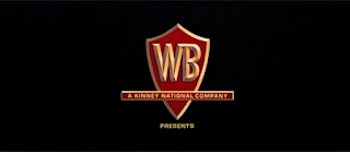
There is one huge element to the success of the Warner Bros. logo, and that is the amount of times it has been interpreted over the past 90 years, yet still stuck to the initial core aspects of it. It all started with 1927's The Jazz Singer, one of the original films to feature the logo, as seen on the left. It presented its studios in the shield with the WB squashed right down the bottom of the shield. This is the basic set up for what would be one of the biggest evolutions in the film logo industries, going from this black and white photo to a logo which looks more like the logo of a petrol station (under original), a Saul Bass edition which debuted in the mid 70's (3
 |
| 1950's |
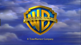
down from the bottom) and the logo which currently resides as the most prominently used design of today (four down from the top). It is unclear why Warner Bros. chose a shield to hold the letters, but I think it is a symbol of being set in stone, as if they are saying that their studio will always be around no matter what. The diegetic music in the background is also another evolving part of the logo, constantly changing with each
 |
| Saul Bass' 1970's |
different design. This is another way in which the studio is willing to mix and experiment with its format, each piece of music reflecting its design in some way, for example, the latest edition of the logo has a very dreamy and almost angelic quality, reflecting the clouds and sky behind the shield.
 |
| Present Day |
I think the biggest reason for the success for the Warner Bros. logo is how they have kept the spirit and original basic layout of the logo, yet as time goes on they have stayed current and kept up with trends but are still recognisable. And this can be applied to any sort of logo design that we do, making a logo unique yet current and fresh. Throughout the last century they have been very willing to simply throw out a design after a few years, the Saul Bass design a good example of this, and completely experiment with another.
Paramount
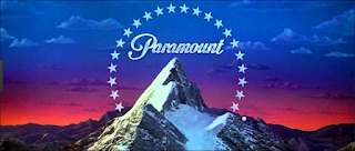
Paramount Studios is one of the most well-known and recognised film studios, and a lot of that is due to the logo and its fame. The first design, top left, was supposedly drawn on a napkin in 1914, and is a picture of the Ben Lomond Mountain. This mountain was quite close to the creator of Paramount studios, William Wadsworth Hodkinson, so he decided to use it as the face of his studio. the 24 stars is very symbolic, representing the 24 actors and actresses who originally signed onto the studio. It then was upgraded to focus more on the mountain-peak in 1952, painted by the chief painter of the company at the time. It did not use traditional film techniques to be displayed, but
instead used a painting to be portrayed. The most current edition of the Paramount logo, created in 1987, has had very little changes made to make it what it is today. It is now CGI, and the stars seem to fly towards the mountain then settle where they are traditionally placed. This choice of CGI was put in place to make the resolution of the image much more clearer, and the pictures in the Paramount Pictures were removed to help
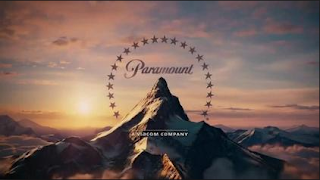
people focus in on Paramount alone. It is also interesting to note that music was only introduced to this logo in the most recent editions, the older ones absent of any sort of sound. The diegetic music reflects the grandeur of the mountain, with trumpets and brass instruments flaring, a grandeur that a lot of film companies want to achieve.
This logo was successful mainly because it is a strong image, the mountain is a presentation of strength and confidence, with the fact of having a century behind them to help be recognisable help. This studio is a little different to Warner Bros. in terms of keeping their image very similar in each change. This can help boost recognisability and can help make your logo iconic.
Dreamworks:

The Dreamworks logo is the newest of the logos I have been looking at on this post, and is yet to have gone through any major changes. It was created by Steven Spielberg, Jeffrey Katzenberg, and David Geffen in 1994, and it is their initials which lie under the main logo. 'The Boy on the Moon' was created by Steven Spielberg, who wanted to recapture the Golden Age of cinema by using a man on the moon. It was the artist, Robert Hunt, who suggested it be a boy instead. Spielberg agreed, and hunt used his son as the

model. In 1995 clouds were introduced to the logo, and this 'Cloud Cover' created a very idyllic and dreamy atmosphere, and the boy on the moon represented the inner child in everyone, speaking to their childhood memories. In the most current update, the colours are brighter yet still idyllic, and the words are now varied in colours. This represents the market of younger children they are aiming for, with a much more child-orientated feel to the logo.
 |
| The Shrek Logo |
This company was successful from the start, firstly because of the men who started the company, who are all major Hollywood players. But also because from the beginning they have presented their company, through their logo, in the spirit they have wanted to capture. With such an imaginative and surreal picture, it truly does grab the hearts and childhood memories of those who do see it. There has always been room for improvement, yet they stick to their original concept and use it to find their audience.


 instead used a painting to be portrayed. The most current edition of the Paramount logo, created in 1987, has had very little changes made to make it what it is today. It is now CGI, and the stars seem to fly towards the mountain then settle where they are traditionally placed. This choice of CGI was put in place to make the resolution of the image much more clearer, and the pictures in the Paramount Pictures were removed to help
 people focus in on Paramount alone. It is also interesting to note that music was only introduced to this logo in the most recent editions, the older ones absent of any sort of sound. The diegetic music reflects the grandeur of the mountain, with trumpets and brass instruments flaring, a grandeur that a lot of film companies want to achieve.
  The Dreamworks logo is the newest of the logos I have been looking at on this post, and is yet to have gone through any major changes. It was created by Steven Spielberg, Jeffrey Katzenberg, and David Geffen in 1994, and it is their initials which lie under the main logo. 'The Boy on the Moon' was created by Steven Spielberg, who wanted to recapture the Golden Age of cinema by using a man on the moon. It was the artist, Robert Hunt, who suggested it be a boy instead. Spielberg agreed, and hunt used his son as the
  model. In 1995 clouds were introduced to the logo, and this 'Cloud Cover' created a very idyllic and dreamy atmosphere, and the boy on the moon represented the inner child in everyone, speaking to their childhood memories. In the most current update, the colours are brighter yet still idyllic, and the words are now varied in colours. This represents the market of younger children they are aiming for, with a much more child-orientated feel to the logo.

Jackson-
ReplyDeleteOVERALL: 12/20
Good historical tracking of the changes that were made, often including symbolic observations as to WHY you think they were made, though not as much in Warner Bros section.
No discussion of audio tracks! Very focused on visuals. Remember that sound also communicates meaning.
Warner Bros-
Work on text formatting. Also, label each logo clearly, as your directive pointers are currently a bit confusing.
Paramount-
Much stronger consideration of symbolism, and the effects of change on a company logo.
Dreamworks-
Again, much better consideration of symbolism along with awareness of history. Could also include further example pictures of the many changes they’ve made to accommodate the ‘spirit’ of a given film (i.e. Shrek, Kung Fu Panda, Monsters v Aliens)
- T. Marcus